In the world of self-publishing, the typeface that you choose is just as (if not more) important than the book design itself. After all, you could have the most authentic and captivating storyline on the market, but if the font is not easy to read or does not accentuate the message, it can easily deter your readers away. In general, readability stringently relies on legibility, making your typeface choice a make-or-break deal for some readers.
Let’s take a look at which fonts are best for self-publishing authors with readability in mind.
It has been long debated whether Serif or San Serif offered better readability for published books. Serif fonts are the more decorative styles that often have higher end-stroke emphasis, which can deliver a more affluent, personalized approach. Overall, this is the traditional font with a formal/elegant undertone, with the most well-known one being ‘Times New Roman.’ Not all self-published books use Serif as their primary, but most do as it is the easier type to read on paper.
On the other hand, Sans Serif is a font type that does not feature any serif lines, giving it a more clean, minimal, and modern feel. The majority of these typefaces have either round or precise edges, can be thick or thin, and can be either formal or informal. In a nutshell, Sans Serif is highly versatile, with the two most popular ones being Arial and Helvetica. Though Serif tends to be used for the self-published content itself, Sans Serif is favored for digital/website content due to its directness and is commonly used for book headers, sub-headers, illustrations, and pull quotes to help it stand out from the rest of the storyline.
For your interior book design, your font choice is entirely up to you. However, there are some notable font/typeface styles that historically work better for publishing books than others. For example, old-style fonts (aka ones designed at the beginning of book printing in the late 15th century) are still the most prominent ones in book publishing today. The reason why is because these fonts were created for the use of calligraphers before the invention of printing, making them already angled for print reading easiness. Today, most Serif fonts are bracketed in those old-style designs, with the most common self-publishing ones being:
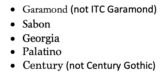
**Times New Roman is not on this list, mainly because it was created in 1931 for the Times of London newspaper. That means this font, though Serif and popular, was better designed for narrow newspaper columns rather than wider book pages. Times New Roman is highly recommended for interior pages in modern publishing.
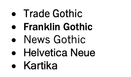
What about Sans Serif? Sure, Sans Serif may not be great for the body content, but it can be a great addition for other areas of your book. Consider using the following Sans Serif typefaces for your headers, footers, or other featured content areas:
Again, this is your published book, and you have every right to use any font you wish. Regardless, if you want the best chances at drawing readers in and keeping them interested, steer clear from hard to read, complex fonts such as:
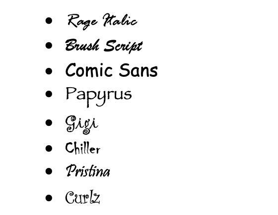
Remember, the idea is to help your reader understand the storyline and message, not be bogged down, distracted, or frustrated by the text they are trying to decipher.
This same logic should be applied when choosing fonts for your cover design.
Serif fonts are considered the best to use for long-form texts and within self-published books. Choosing one from the Serif list above can help your readers glide through the pages more seamlessly, making it easier for them to form that desired imagery under the letters. However, don’t forget that Sans Serif has its own set of advantages too, especially when it comes to digital text, book headers, and other self-published content areas that deserve to be highlighted. Sans Serif fonts are also great to use for your book cover.
Choosing the perfect font for your book design is certainly not something to take lightly or overlook. Even more, this does not have to be a decision you have to make entirely on your own. If you're still on the fence on which font/typeface to select or need more tailored support on which direction to go, then please don’t hesitate to contact us to speak with one of our designers to help point you in the right direction. Our 48 Hour Books team are experts in matching fonts with unique storylines and would love to help you achieve the publishing success you deserve.
Check out these blogs and resources from 48 Hour Books to help you on your self-publishing journey:
Typesetting Tips: Terms to Know
Common File Problems: Are Your Book Files Ready?
Sign up for the 48 Hour Books newsletter to learn how to self-publish your book — and get it printed faster with us than anywhere else.
Sign up for the 48 Hour Books newsletter to learn how to self-publish your book — and get it printed faster with us than anywhere else.
Subscribe to the 48 Hour Books Newsletter for more self-publishing tricks and tips, author spotlights, notices about upcoming deals, and more!

